| |
|
|
How To Get Spot Color In A Process
Color Print Job
|
 |
|
|
|
|
|
|
When printing a four color job (process
color - more
here), all colors are created by mixing only four
basic colors of inks - cyan, magenta, yellow and black.
One of the advantages of using spot color (such as PANTONE®
- more
here) is that areas of solid color (such as those
for text and line art) will appear crisp and distinct.
In process color print jobs, these areas will often
appear fuzzy and indistinct. This is because all the
colors in a four-color job have to be mixed from the
four process color inks (cyan, magenta, yellow and black).
Anything less than 100 percent of any one ink will be
rendered as halftones (more
here on halftones). Halftones are composed of tiny
dots of ink. These tiny dots are the cause of the fuzziness.
If you want a crisp appearance of text and line art in
a four-color job, you can either make it a five-color
or six-color job and use a spot colors in combination
with the four process color inks, or you can work around
this limitation by using variations of the cyan, magenta
and yellow color inks which use 100 percent of each ink.
Shown below are color swatches that illustrate the point:
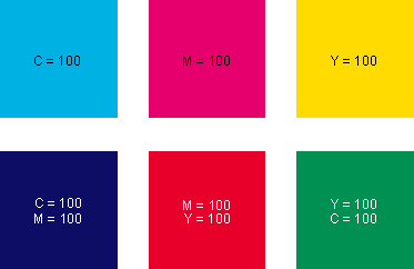
Admittedly, this is a very limited set
of colors, but with clever planning you can design a
layout that uses only the four basic process color inks
and give it a look that otherwise could only be achieved
in a five or six-color job.
Red - The Color That Pulls Responses
In space advertising, red is often used as a spot color
to add emphasis (such as prices, heads, callouts or
splashes). A two-color ad (black plus one spot color)
using red as the second color will pull more responses
than any other color. The principle works the same in
four-color ads. Red is the best color to use for adding
emphasis if you want responses. If the designer uses
a mix of 100% magenta plus 100% yellow for the red color,
then there will be no halftone dots where these inks
are used. There will be a solid patch of yellow and
a solid patch of magenta which overprint giving a crisp
and distinct appearance.
CMYK Swatches PDF File
You can download the cmykswatches.pdf file below and
print it out on a color inkjet or laser printer or on
a commercial printer such as those at your local copy
shop or print shop. You can then keep it at your desk
or show it to clients when they participate in the color
selection of a job you are working on. It is better
to output it to a PostScript®
printer because the colors will be closer to the actual
printed output. I didn't prepare the PDF with any color
management (no embedded profiles) so the colors in the
printout will vary from device to device, but they should
be close enough when used as described in this article.
Instructions:
1. First download and install the free Adobe
Acrobat® Reader
2. If you wish to view the PDF file
only, simply click on the link below
3. To download in Windows®:
Place mouse pointer on the link, then right
click the mouse.
For Internet Explorer®:
"Save Target As..."
For Netscape®:
"Save Link as..." then
save it to disk
4. To download in Mac®:
Hold the mouse button down for a second or
Control + Click and a pop up window will appear.
For Internet Explorer: "Download Link
to Disk"
For Netscape: "Save this Link as..."
then save it to disk. |
|
|
|