| |
|
|
Miscellaneous
Tips and Tricks For QuarkXPress™ - Part One |
 |
|
|
|
|
|
|
 |
|
Note:
Many tips and tricks for QuarkXPress detailed in
the context to which they apply can be found in
the Technical
Manual Tutorial. Some of them may be mentioned
here and will have a link to that tutorial where
they are best described. |
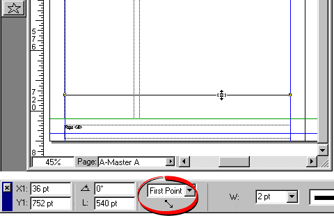
Tip No. 1
Setup the Measurements palette so lines are measured
by "First Point". This choice gives you the
X1, Y1 coordinates along with the line's angle and length.
The default of "Endpoints" gives you the X1,
Y1, X2, Y2 coordinates and is not as easy to work with.
Tip No. 2
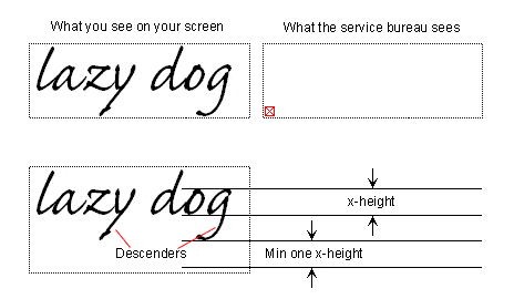
For the height of all text boxes allow a minimum clearance
of one x-height below the lowest descender of the font
used in the text box (a font's x-height is the height
of the letter "x"). There are minute differences
between computer systems. If you establish a text box
height that is too tight on your system, it is liable
to be too small for the text to display or output on another's.
The example below illustrates what can happen and just
how deep your text boxes should be to avoid this.
Tip No. 3
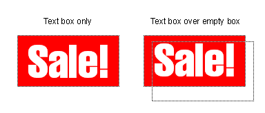
When making text boxes with reversed type or with colored
backgrounds, it is better to make separate objects for
the background and text rather than make it as a single
object. In the example below, the preferred method is
the one on the right. See Tip No. 2 above for why. The
output result of the one on the left below may be a plain
red box with no type. more
on this here
Tip No. 4
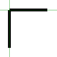
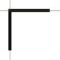
When making corners from intersecting lines, be aware
that measurements and snapping occur from the midpoint
of the line. In the example below there is a corner made
from the intersection of two 8-point wide lines. Both
the horizontal and vertical lines on the left have the
same x and y coordinates. In the example on the right,
the horizontal line was shifted to the left 4 points (half
the line thickness) to make a mitered corner. Likewise,
if 1-point wide lines are used the shift would have to
be .5 point to compensate.
 |
 |
Tip No. 5
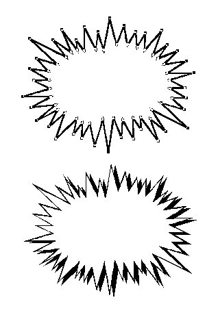
A simple ad splash can be made from a polygon. Create
the polygon, give it a 1-point black frame and a white
box color. Then drag and drop it into a library and save
it with other library items. In the example below, the
top item shows the polygon points, and the bottom one
was made by making a copy of the polygon for a shadow.
The shadow was given a black box color.
Tip No. 6
When you have applied a paragraph style and want to remove
it without changing the appearance of the text, Click
Style > Paragraph Style Sheet > No Style.
This removes the style sheet link and effectively applies
local formatting to the text.
Tip No. 7
Once you have setup local text formatting on a block of
text and you need to use it repeatedly in your document
but you don't want to create a style sheet, you can save
a lot of time simply by copying only one or two characters
and pasting them at the location where you want to repeat
the style. This will save the repetitious mouse clicks
required to set it up each time.
Tip No. 8
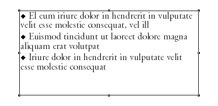
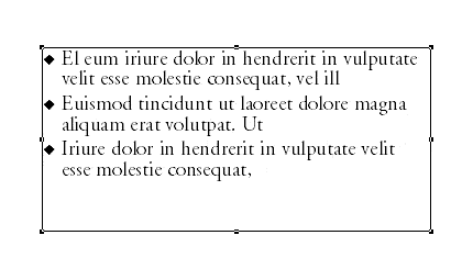
Numbered and bulleted lists often use a hanging indent.
A hanging indent is where the text is indented to the
right of the bullet or number. To make a bulleted list
style like the example below, do one of the following.
In both examples The base
style is 14 point AGaramond with 14 points of leading
and a space after of 3 points. The Zapf Dingbat
bullet is a 10 point character created from a keypress
using the lowercase "u" (both
Macintosh or Windows). There is one blank space of
AGaramond after the bullet character and before the
main body of text.
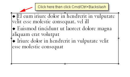
Fastest Way:
In the text, paste a bullet character
(e.g. using the Zapf Dingbats font) in
front of the each item in the list:
Position the insertion point where you want the text
to wrap and click Cmd+Backslash (Macintosh®) or
Ctrl+Backslash (Windows®):
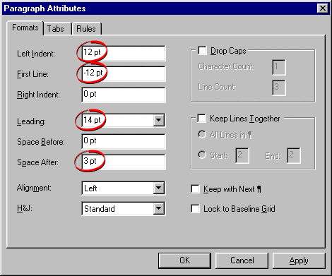
Alternate Way:
Select the paragraph and
click Style > Formats... In the dialog enter
a positive number for a "Left Indent" amount
and the same number as a negative number for a "First
Line" amount. Then paste a Zapf Dingbat character
for a bullet in front of the first line. Save the formatting
as a style sheet and apply it to the remaining paragraphs without
the bullets.
Paste the bullets after applying the style sheet.
In this case I used 12 points for a "Left Indent"
and -12 points for the "First Line".
Tip No. 9
When making paragraph styles to separate paragraphs
use either "Space Before" or "Space After"
but not both...otherwise you may wind up with a confusing
mess. I prefer "Space After" because most of
my text is top aligned (Ascent) and all my text boxes
have extra space at the bottom.
Tip No. 10
Set your leading to the same number of points as the
point size of the font you use. Example, with a 14
point font, set the leading to 14 points. Quark's "auto" leading
is a bit too loose for my taste. more
on this here...and more
here also.
Click
Here To Continue...
|
|